Salesforce Lightning Icons
These handy i9mages are a widely used resource within the Salesforce Lightning application. For example, each Standard object in Salesforce has its own unique Icon that helps to identify it. Similarly, Lightning uses many other widely known icons as buttons for users to perform tasks – including the Settings gear and Filter funnel:
Why Icons?
Icons are a great way to display information to users without having to use text. Text generally takes up more space, so utilizing icons allows developers to fit more into a single screen.
This is especially true for mobile, where the screen is very small. To put this into perspective, think about the widely known Facebook icon, the letter “f” iniside of a blue dot. Most users can tell instantly what this icon represents and what will happen if they press it on their phone. Likewise the same can be true within Salesforce, so it’s important to keep this in mind when designing custom Lightning Components.
Implementing Icons
Salesforce provides a large number of Lightning Icons to users to design and develop with and as you can see from the link, there are 5 different categories:
- Action
- Custom
- DocType
- Standard
- Utility
In order to reference a specific Icon in code, use the following format: [IconCategory]:[IconName]
Example:
To reference the first action icon in the list – add_contact – you would use action: add_contact

Lightning Icon Aura Component
The most common method for adding a Lightning Icon to a custom component is the lightning:icon. This aura component is used simply to display an image to the user to enhance what they are looking at. Subsequently, this component can be used on its own, or within another component, such as within the title of a custom Lightning Card component.
Lightning Component Attributes
The Lightning Icon component comes with several built in attributes:
- iconName – Required attribute, contains the name of the Lightning component in the correct format. This would contain “action:add_contact” from the example above.
- alternativeText – Helpful text displayed to the user
- Class – For styling using CSS classes
- Variant – For styling, changes the base color of the icon using 4 Variants:
- inverse – Reverses the color of the icon, best used on dark backgrounds
- success – Turns Icon green
- warning – Turns Icon yellow
- error – Turns Icon red
- Size – For styling, changes the size of the icon and is defaulted to medium. There are 5 sizes:
- xx-small
- x-small
- small
- medium
- large
Putting Lightning Icons all together
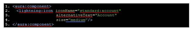
Basic Icon
Below is code that would display a basic icon for the standard Salesforce Account object:

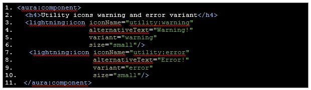
Icons with Variants
Below is code to display utility icons (naturally plain black icons) with variants in order to change the color:

Go on, git!
Once developing with Salesforce Lightning Icons comes naturally, be sure to look into the lightning:buttonIcon aura component. Similarly, the setup of icons in this aura component works the same as in the basic lightning:icon component, the difference is that this is a button so it has extra attributes meant for handling actions and events. However, note that the Button Icon can only utilize Utility category icons at this time.
To learn more about Salesforce Lightning Icons or talk to one of our experienced consultants, contact us today!